YouTube may have originated on the desktop (more than a decade ago!), but now mobile and the living room are two of its most important platforms. The latter is receiving an update today: Game consoles, streaming devices like Roku, smart TVs and of course the Chromecast will all get a small but important change. Now, when you load up YouTube, you'll be presented with a variety of different content tabs right at the top of the interface. It's now much easier to flip through topics like sports, news, comedy, music, entertainment and so forth.
Google previously had similar categories hidden in the left-side menu bar, but the company thinks that moving them front and center will help users find content faster and keep them watching longer. The categories themselves have also been refined a bit, with some new additions and subtractions getting to the 14 total you'll find now. It's something YouTube has been working on ever since it started designing its own consistent interface across the big screen in 2013. Previously, YouTube had an open API that device makers could tap into and make their apps, but that led to inconsistent experiences and new features being left behind.
YouTube is one of the most widely
available video streaming apps out there, and one of the oldest, as well. Over
a decade old at this point, you’ll find YouTube on everything from brand new
phones to cheap TV sticks these days. While the mobile version of the
app is being left as is for now, a number of major changes have hit the
big-screen version in the US with the latest update. The changes mostly apply
to the app’s categories, and make things much easier to navigate. Users on game
consoles and other devices without keyboards will be glad to know that the
updates are also aimed at reducing the need to type.
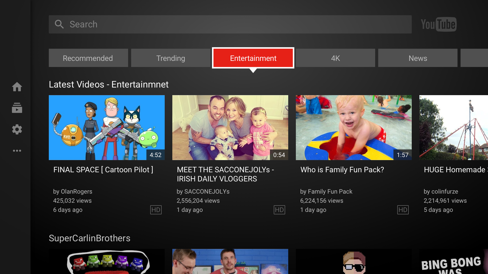
For starters, categories have been moved from
their place in the sidebar. They now sit proudly up at the top of the app’s
main screen, reachable in a single keystroke or button press. The selection of
categories has been revamped and refined, and a number of them have been
removed. Rather than offering less choice for users, however, this change
actually sets the stage for the other big new feature; sub-categories. Upon
opening up a category, users will be presented with a listing of sub-categories
and genres that can get rather specific and mostly depend on current trends and
the user’s own YouTube history, much like the My Mix function. There is also a
“Top Stories” in each category that shows users the most trendy videos in that
category at the moment. In total, there are now 14 categories to choose from
when browsing content. Another big change is the addition of a function to
seek out live content. Users can check out the new “Live” tab up top to see
streams happening right that second in real time, some of which may be viewable
by category.
Users of most living room devices that
display YouTube should see the changes rolling out gradually within the next
few weeks or so, but Apple TV users won’t be getting this update; their version
of the app is touted as “feature complete”, so these changes should already be
on board. The feature is only in the US for now, simply because curators in
each country have to help with making the categories and sub-categories. For
now, no timeline has been given for an international rollout.
YouTube
also added a new live streams section. There's a top "live" area that
shows you a variety of streams happening right at the moment you're looking,
and (in some cases) you can find live streams specific to the top-level
categories when you start drilling down.
This
update is rolling out today to basically every device that displays YouTube on
your big TV. The only notable exception to that is the Apple TV, which has its
own YouTube app that integrates with Siri and that Google maintains separately.
Apple TV users aren't missing out on anything at the moment. But if you're
watching YouTube on pretty much any other device (provided it was made in the
last four years or so), the new interface should show up soon.
However,
just note that only users in the US will see this change, at least for now. Ali
said all of the recommendations need to be localized to get the right mix of
content in that's relevant to a particular country. It sounds like eventually
other regions will get this update, but for the time being it's restricted to
the US.
No comments:
Post a Comment